Borrow the House's Vocabulary: A Fence-Matching Guide for British Homes
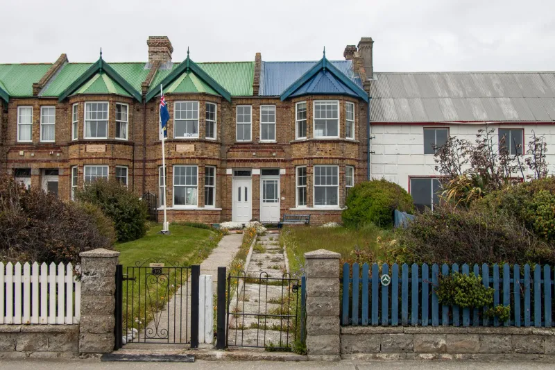
A fence is often the first thing you see before you see the house. That gives it a slightly unfair job: it has to do practical work—privacy, security, windbreak, bin screen—while quietly agreeing with the building behind it. Get it right and nobody notices. Get it wrong and the whole frontage feels like a good outfit with the wrong shoes.
The trick is not to buy a fence that looks nice in a brochure. It is to borrow the house's vocabulary. Look at its proportions, its materials, its colour and its level of detail, then decide whether your boundary should echo those things or deliberately contrast with them. Both can work. What rarely works is ignoring the house altogether.
Start With the House, Not the Catalogue
Before you measure anything, stand across the road or at the end of the garden and look at the building properly. What are the window proportions? Is the roof steep or shallow? Are the walls brick, render, stone, timber cladding or something painted? Is the detailing fussy, plain or somewhere in between?
A Victorian terrace with tall, narrow sash windows is asking for a boundary with a bit of verticality and slimness. A 1930s semi with curved bays and pebbledash is often happier with warmer, softer materials. A rendered new-build with crisp corners can take a sharper, more minimal fence. A modern extension in dark cladding may want the boundary to step back and let the architecture do the talking.
This is not about slavishly matching. It is about making a fence that looks as if someone thought about the house it belongs to.
Victorian Terraces: Slim, Sharp and a Little Formal
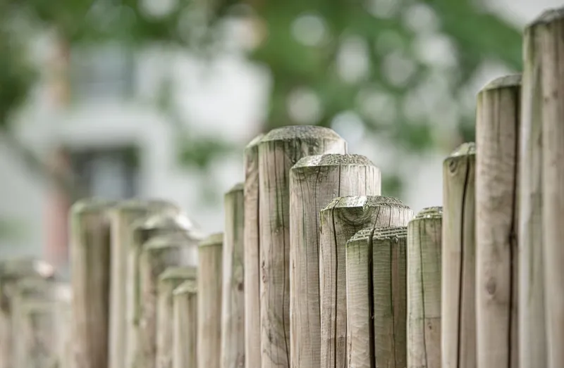
Victorian terraces can be tricky because the front garden is often tiny and the house itself is tall. A chunky six-foot panel across the frontage can feel like a wall with delusions of grandeur. More often, the better move is a low boundary—railings, a slim picket-style fence or narrow vertical slats—finished with a simple finial or cap.
In the back garden, privacy matters more, but keep the detailing slender. Narrow boards, neat posts and a dark paint finish can look smart without turning the garden into a stockade. Avoid heavy trellis tops and busy scrollwork unless the house already has that kind of ornament. The fence should support the terrace's upright rhythm, not compete with it.
1930s Semis: Warm Timber and a Softer Line
A 1930s semi often has bay windows, red brick, rendered upper floors and a gentle curve or two. It is a friendly sort of house, and it usually suits friendly materials. Warm timber—horizontal boards, a simple vertical board fence or a low painted picket—tends to sit well.
Colour is where these houses can really sing. A soft sage, muted grey-blue or warm off-white can pick up render tones or contrast gently with brick. Orange-brown timber can look lovely when it is new and slightly loud when it is not. If you want a natural finish, choose a stain that keeps the grain visible but tones down the yellow.
Curves are worth considering too. If the bay or the path already curves, a gently curved fence run or an arched gate can make the boundary feel part of the house rather than a rectangle dropped in front of it.
Cottages and Stone: Let It Settle In
With older cottages, stone walls and lime render, the best fences often look as though they have been there a while. Cleft chestnut, woven hurdles, weathered oak and simple post-and-rail are all good companions. These materials have texture and irregularity, which suits buildings that are not perfectly straight either.
Avoid anything too shiny, too uniform or too aggressively modern unless you are making a deliberate contemporary contrast. A cottage in a conservation area may also have restrictions on materials and heights, so check before you fall in love with a design. In many cases, a modest indigenous-style fence will be more in keeping than a tall, close-boarded panel—and it will age more gracefully in wet British weather.
Rendered New-Builds: Crisp Lines, Softened Edges
Rendered new-builds often have clean corners, small window reveals and a limited palette. That can make a simple, well-detailed fence look excellent. Horizontal slatted screens, narrow vertical slats and flat-top panels in charcoal, grey or stained timber are all natural fits.
But crisp can tip into cold. Soften the boundary with planting—climbers on sturdy supports, shrubs in front of the base, or a run of ornamental grasses—so the fence has something to settle into. Keep the detailing quiet: hidden fixings, neat caps and consistent spacing will do more for the look than decorative panels.
Modern Extensions: Contrast Can Be the Point
If your house has a modern extension in dark cladding, glass or crisp render, you have more licence to contrast. A simple slatted screen, a black metal railing or a clean horizontal board fence can look intentional next to older brickwork because the extension has already set up that conversation.
Just be careful not to create three competing styles. If the extension is the bold move, let the fence be the calm reply. Repeat one material or one colour from the house, then keep everything else simple.
Colour: Match, Echo or Contrast
There are three sensible approaches. Matching means using a colour very close to the house—useful for rendered walls, less easy with brick. Echoing means picking up an undertone: the grey in stone, the green in slate, the warm red in brick. Contrasting means choosing a colour that is deliberately different but still harmonious—charcoal against pale render, soft green against red brick, natural timber against white walls.
What tends not to work is the default orange-brown panel that ignores both house and garden. A sample pot and a patch of fence in daylight will tell you more than any screen.
Proportion and Detail Matter More Than You Think
The top line of a fence is very visible. A wavy or uneven top can look charming in a rural setting and scruffy in a suburban one. Posts should look substantial enough for the run, but not so chunky that they overwhelm a small front garden. Caps, trims and gate furniture should relate to the house's level of detail: simple for modern homes, slightly more decorative for period ones.
Height is not just an aesthetic question. In England and Wales, permitted development generally allows fences up to two metres, or one metre next to a highway, but conservation areas, listed buildings and local conditions can change that. In front gardens, a tall solid fence can feel hostile and may need permission. Check with your local authority before committing.
A Quick Checklist Before You Buy
Look at the house from the street and decide whether you want match, echo or contrast. Check the dominant material and colour. Note the window and door proportions. Decide how much detail the house can carry. Consider the local street scene—not to copy it, but to avoid an obvious clash. Check planning constraints. Then choose the simplest fence that satisfies privacy, maintenance and the look you are after.
A good boundary does not shout. It makes the house look as though it belongs exactly where it is—and that is the quiet bit of design worth paying for.